Microlandscapism
The perception on our earth landscapes from a creator or master designer (God)
Research on movement and -ism’s
Movement within graphics is regarded as a change or shift in thinking or presentation.
Some notable historical isms in graphic design are; Minimalism, futurism, Dadaism, romanticism, anarchism and surrealism. In may also reflect a change of thinking within society such as Feminism.
These have particular styles associated with them such as type, image and narrative. Movement appeal to a particular target group and can become a populist movement.
EXAMPLE OF minimalism
noun: minimalism
- a movement in sculpture and painting which arose in the 1950s, characterized by the use of simple, massive forms.
- an avant-garde movement in music characterized by the repetition of very short phrases which change gradually, producing a hypnotic effect
- deliberate lack of decoration or “finishing touches” in style or design.
“his living room was a testament to minimalism”
(dictionary.com)
The development of futurism in design
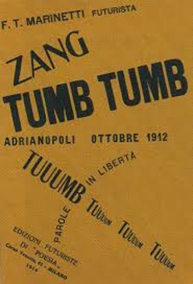
Futurism was not only an art movement but also a social movement that originated in Italy in the early 20th Century and influenced graphic design. Marinetti’s onomatopoeic graphic poem “Zang Tumb Tumb” published in 1920 is an iconic forerunner of the futurism movement as it used vertical and horizontal elements in the expressive typography. The poem relating to the Battle of Tripoli uses the poetic drumbeat to imply the repetition of war. The use of a variety of columns and deliberately not setting out in traditional lines of text, but uses fragmented lines of text and varieties of typeface to move into the futurist format of graphic design. The importance of this style was because it moved away from the historic form of printing press typeset in horizontal rows but required an artistic format when setting out the letter blocks.
In February 1910, Umberto Boccioni, Carlo Carrà, Luigi Russolo, Giacomo Balla and Gino Severini signed the Manifesto of the Futurist Painters who railed against the concept of value everything that was old, statues, paintings, bric-a-brac and that hosted in museums. They considered the habitual contempt for everything which is young, new and burning with life to be unjust and even criminal.
This influenced the emerging European culture of Avant-garde in both art and graphic design.
Avant-garde (French for advanced guard, vanguard or forerunners)
The Avant-garde movement relate to people or works that are experimental, radical, or unorthodox with respect to art, culture, or society. Pablo Picasso’s cubist movement impacted on the development of other art and design movements.
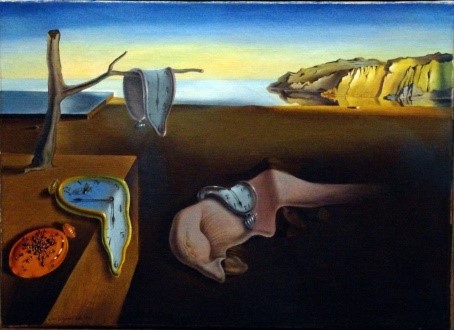
In the sense of the art or graphic design movement this spawned Dadaism based in Switzerland and utilised aspects of expressionalism, futurism and cubism. Famous art exponents were surrealists Salvador Dali and Marcel Duchamp. Dali was famous for his surrealist dripping clocks.
Modernist self-publicist magazines such as those in the illustration helped to create a movement throughout Europe where a changing typography became a new universal visual language. Key individuals involved in the modernist movement—El Lissitzky, Kurt Schwitters, László Moholy-Nagy, Hans Richter, Theo van Doesburg, Lajos Kassák and Karel Teige used the magazines as a platform that extended their reach to art, architecture, films and advertising.
There was also a strong Czech and Russian avant-garde movement during the 1920’s which reflected the sociological and political upheaval in both nations. According to Richard Hollis, The publication, ‘USSR in Construction,’ became the most “highly developed and consistent achievement of Soviet graphic design.” Use of photo montage, central images and specific fonts on a variety of media from film, poster or banners in graphic design were key elements in Soviet propaganda.
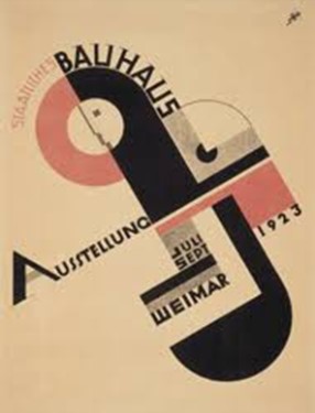
Bauhaus Movement
Leading this modernist movement in central Europe was the most influential Bauhaus School of Art and Design, so much so that it created its own Bauhaus movement.
Based in Weimar Germany, and established by Walter Gropius in 1919, its goal was uniting art and industrial design, and it was this which became its most original and important achievement. The school is also renowned for its artists Wassily Kandinsky, Josef Albers, László Moholy-Nagy, Paul Klee and Johannes Itten, architects Walter Gropius and Ludwig Mies van der Rohe, and designer Marcel Breuer.
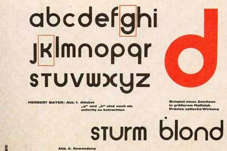
Included in the revolutionary idea was the typeface and font used that not only followed the new layout from the Italian futurist movement but designed new fonts. The new fonts were a far cry from the traditional calligraphic lettering used in historic Germanic writing whose archaic form did not work well with the modern machine age.
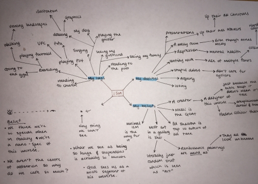
Idea generating
Using the creative thinking technique of mind mapping, I separated my thoughts into three sections; my likes, dislikes and beliefs. This helped me categorize my thoughts and gave structure to my ideas.
my likes included:
- singing
- playing the guitar
- drawing
- illustrations
- exercising
- heading to church
- viewing landscapes
my dislikes included:
- losing
- mental health issues
- using multiple fonts in a poor format
- both atheists and religious people who are too upfront about it
my beliefs
- belief in a creator
- belief in a designer of the universe
- Lionel Messi is the greatest footballer of all time
- minimalism is the best form of ism
- most art in a gallery is terrible
After contemplating on what route I should take, I noticed a recurring topic of religion / a creator within each category. However, as I really enjoy landscapes, I saw this as an opportunity to combine both my passion of landscapes with my religious belief.
Idea Refinement
Creationism x microlandscapism
A form of Creationism is to give credit to an intelligent design
According to Wikipedia Creationism is the religious belief that the universe and life originated “from specific acts of divine creation”, as opposed to the scientific conclusion that they came about through natural processes.
As designers, graphic or otherwise, we like to give credit to the designer of their creation. Each item we look at or use we see that perhaps a lot of thought and consideration has gone into the design and construction. We understand that there is an intelligence behind that product or outcome. Therefore, creationism is a movement to give credit to the creator. We recognise that even the planet so delicately balanced, perfectly structured to the minute detail and wonderfully made, points to the argument that there is a creative process and creator behind it all rather than a generation of a perfectly balanced planet purely by random chance.
Put another way, the intelligent designer or as some would refer to as “God,” is a very creative artist and engineer. My argument is not for or against the methodology or science of how it was done, but simply that it was done. It is not even an argument between evolution and Biblical creationism but simply a suggestion that with an implication of a creator and designer, the concept of size becomes relative.
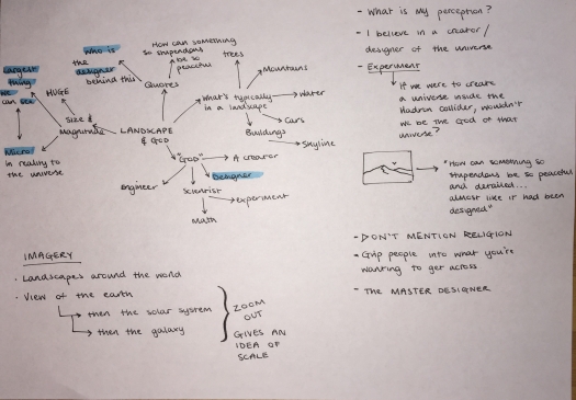
How does this relate to an artistic or design movement?
The connection with the landscapes is that we often see landscapes as huge, magnificent and stupendous. We marvel at the rugged nature of mountains, the calm of a meadow or lake and the lush vegetation of the forest. The contradictions and juxtaposition of the contrasting landscapes serves to prove rather than disprove its majesty.
And yet for us humans, even with peripheral vision, often the grand landscape is the largest thing our naked eyes can comprehend. And yet if there was a creator as the term creationism implies, we could hypothesise that to the creator, the landscapes of earth are micro in his eyes.
Micro-landscapism is trying to comprehend this perception much like the Google Earth is able to zoom in and out of a specific location. With the ability of modern viewers using technology available on a home laptop or even mobile phone, it is not uncommon for viewers to consider this viewpoint. And therefore this form of art is now very accessible and plausible for the modern viewer. It also becomes interactive for the viewer who has to physically zoom in and out to view what could be on display but is at first glance an unknown quantity or visual offering.
A history of isms or artistic movements
Concepts of landscape designs


Concept development


Concept Refinement


Alternative ideas for landscapes


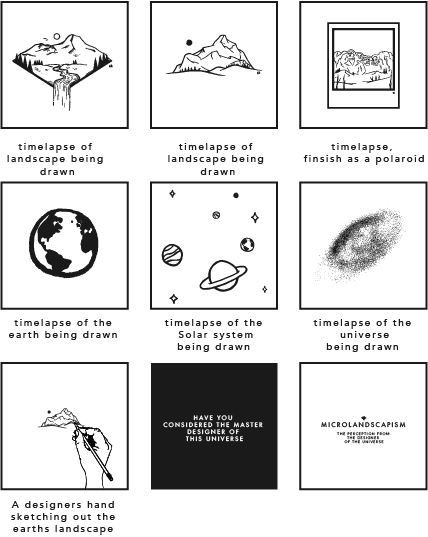
Storyboard first draft
My storyboard shows 9 scenes of how I’m wanting to portray my Microlandscapism movement. It depicts 3 landscape scenes being sketched and drawn out as a time-lapse process showing detail, errors and final touches.
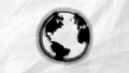
It would then transition to a scene of the world being sketched and drawn to give a sense of scale to the landscapes in comparison to the size of planet earth.
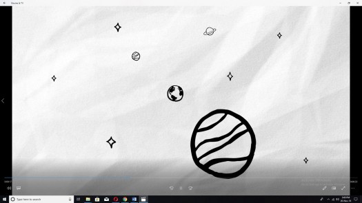
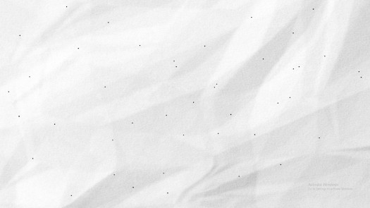
This idea of scale is showcased through the next two scenes, as my intent would be to transition to the solar system and to show the magnitude of the other planets compared to earth. This idea would continue and show our galaxy to give a real sense of how micro we as a planet are.
I intend to show a hand sketching out one of the landscapes to imply the designer in this creation and to give the viewer a sense of art and design behind our stupendous yet beautiful landscapes.
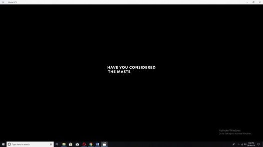
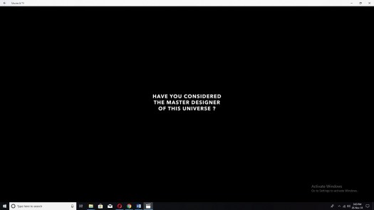
furthermore, I would like to end the animation with simple text asking “have you considered who the master designer of the universe is?”. I’d ask this in order to make the viewer question their belief, and to imply a religious context in a nonreligious form.
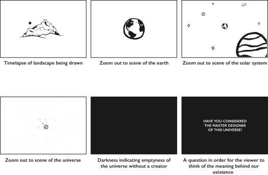
Story board second draft
My second draft is a newer version of the first storyboard, however, I have cut down scenes in order for it to flow and to give a more clear understanding of the message I’m trying to get across to the viewer.
Furthermore, it begins with a timelapse drawing of a landscape design, indicating a concept of design to the animation and gives it life. This will follow with a zoom out transition of the earth to set an idea of scale. The zoom out effect is important in order the give a comparison of size to the viewer.
This zoom transition continues for the next two frames where the viewer will see the scale of Earth compared to our solar system, and thus our solar system in correlation with the universe.
The importance of this transition is to connote the term “micro” in relation to the original landscape scene. I want the viewer to understand that we are so nano compared to the sheer size of our universe. However, with the level of precision and detail our universe has, surely there is a master designer behind it all…
Creating my animation
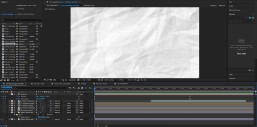
In order to create my animation I had to become familiar with Adobe After Effects, a programme I have not used before. I used tutorials from Youtube to give me a rough guide of what I was supposed to be doing and to gain an understanding with how After Effects works.
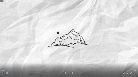
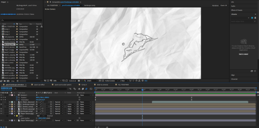
I created a new composition with a 1920 x 1080 resolution at 30 frames per second. My first stage was to create a time-lapse animation of my landscape being drawn. I wanted the clip to have a theme throughout, and as it was intended to be drawn, I used a paper texture as the background layer to give it a real sense of pencil and paper.
Once I had added this paper texture, I imported my landscape design and placed it above the paper background layer. After adjusting the scale of the landscape to fit appropriately, I applied the vegas effect from the effects & presets panel and adjusted its settings so that it was correct. It was crucial that I changed the blend mode to transparent and the colour to a light grey. Once adjusted, I opened the image contours and changed the channel to Alpha so that the Landscape was now visible.
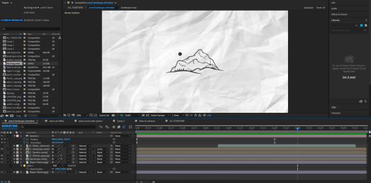
It was now time to animate, so to begin, I made sure I was at the first frame and applied a keyframe. In addition, I added a second keyframe at around the four second mark and changed the length value to one. However, I needed to add a new effect, so I opened Turbulent Displace effect and applied it to the landscape layer at the four second mark.
Moreover, I applied Easy Ease to both layers and opened the graph editor to adjust the end Keyframe.
I created a pencil stroke PNG on my iPad and placed it above both layers and changed the track matte to Alpha matte so that the pencil stroke would appear inside the landscapes lines. After adjusting some more settings and making duplicate copies of the landscape layer and paper texture layer, I highlighted all layers and used the cube icon to add 3D properties to all, except one of the paper texture copies. It was time for me to use the camera tool which allowed me to have a 3D rotation on my animation. I positioned the camera layer on top of everything else and added a keyframe at around 6 seconds for where it would stop its rotation.
My next composition was way less complicated, however, I needed assistance from youtube in order for me to complete it. The purpose of this composition was to have the zoom out transition that I so desperately needed.
I begun by placing the image of my landscape and the image of the world as two separate layers. I trimmed the image of the landscape to the initial second of the composition. With the image selected I added a scale keyframe at that one second mark and changed its scale to 50%. By pressing CMD and the left arrow key four times, I was able to jump backwards four frames and set the scale value to 100%. This gives an animation of the image scaling down by 50%.
The next step was to select the second image of the world and add a scale keyframe of 200% at the midpoint between the keyframes of the previous image. I then jumped four frames forwards, by pressing CMD and the right arrow key four times, and set a scale keyframe of 100%. In order to make the animation seem more fluid, I applied the Repetile effect to the first image of the landscape and expanded it so it fit the entire frame. By selecting tiling, choosing unfold, and adding motion blur to both images the quality of the animation exceeded my expectations.
Furthermore, I applied this same effect to both the solar system image and the universe image which gave it the appearance of zooming out.
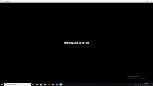
My next steps were to create a new composition pure for text. I wrote the question “Have you considered the master designer of this universe” on a dark grey background to give contrast to the white of the paper texture. I applied a typewriter effect to the text, and gave it a keyframe to where it would drop off, leaving a brief, empty, dark grey background. This followed by the finishing text “microlandscapism” in order to end on the name of the movement.
I inserted all the compositions together into a new composition, which had a 1920 x 1080 resolution and 50 frames per second. Once all the compositions were in the right order, I inserted audio of my Pastor, Rev Simon Jennings, narrating to the clip. In addition, I added the audio of a chord progression played on a keyboard onto the clip. I created this on GarageBand and in my opinion, brings it all together. It is soft, yet powerful…